A wee side step in the Blog timeline. I will get back to the Bon Accord story and how it has almost killed me but for now i'll write about another one that's almost killed me! : )
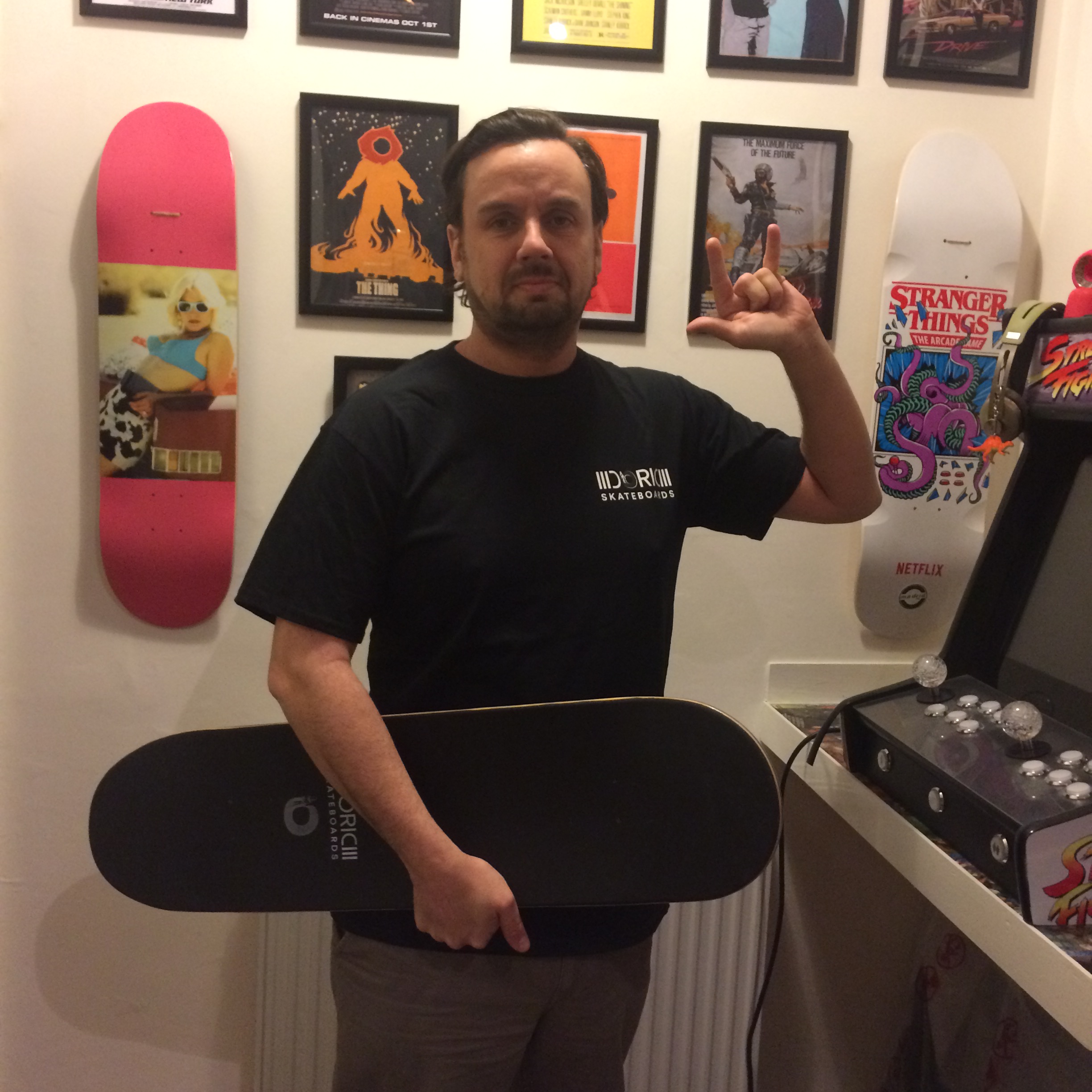
The idea of a collaboration hadn't really entered my mind when setting up Doric Skateboards. I was happy enough with my own ideas and to be honest - a massive control freak.
BUT - collaborating with local artists who are also influenced by Aberdeen and the North East of Scotland? That could work, right?
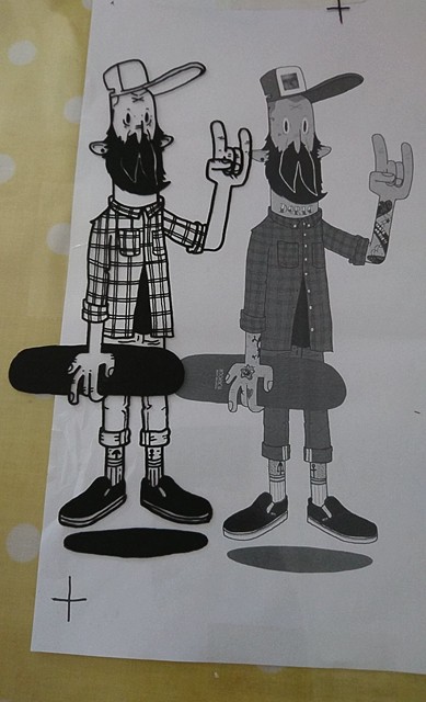
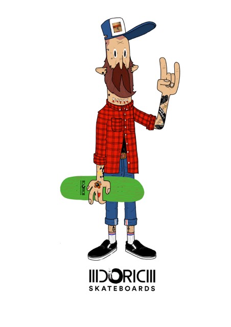
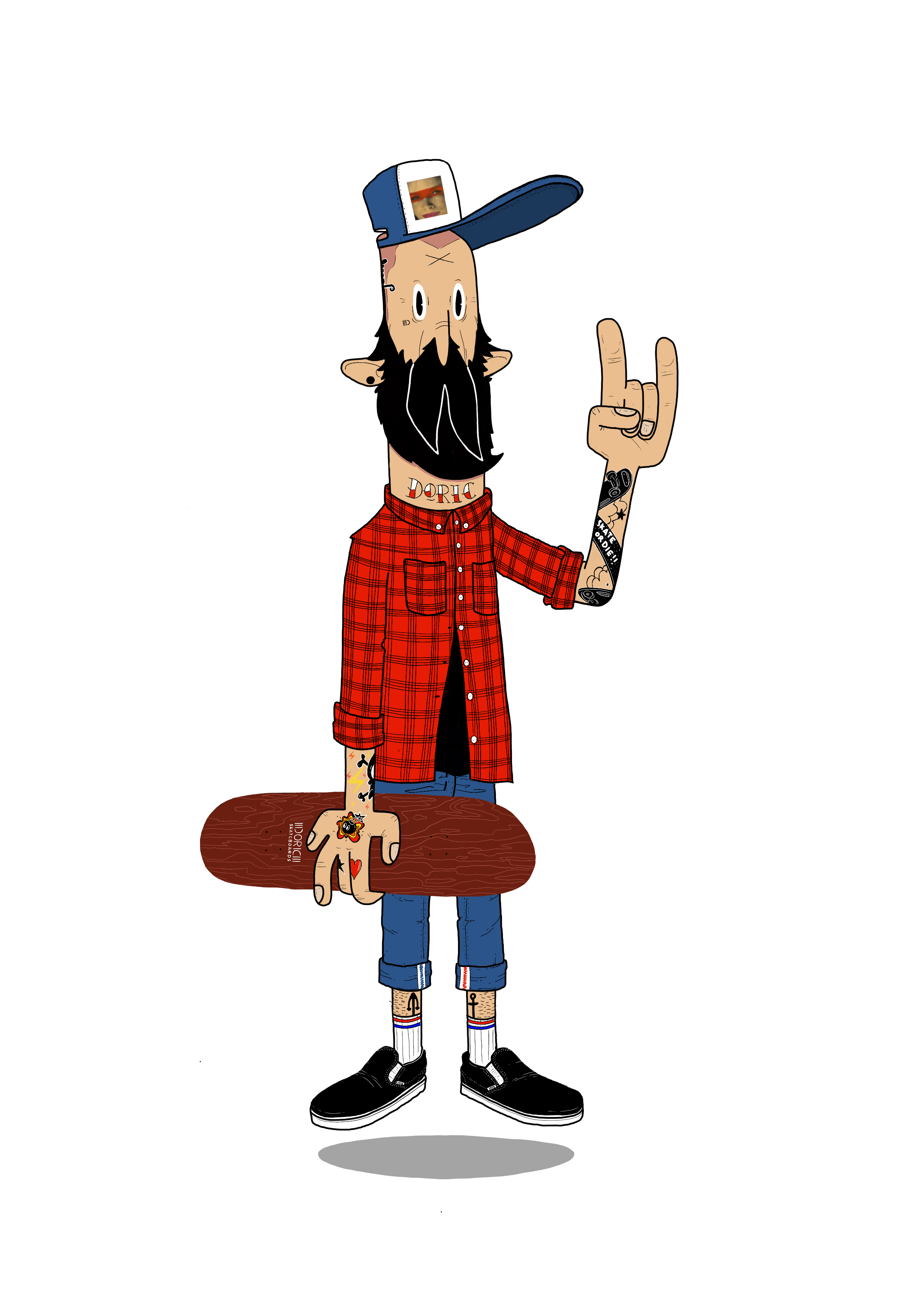
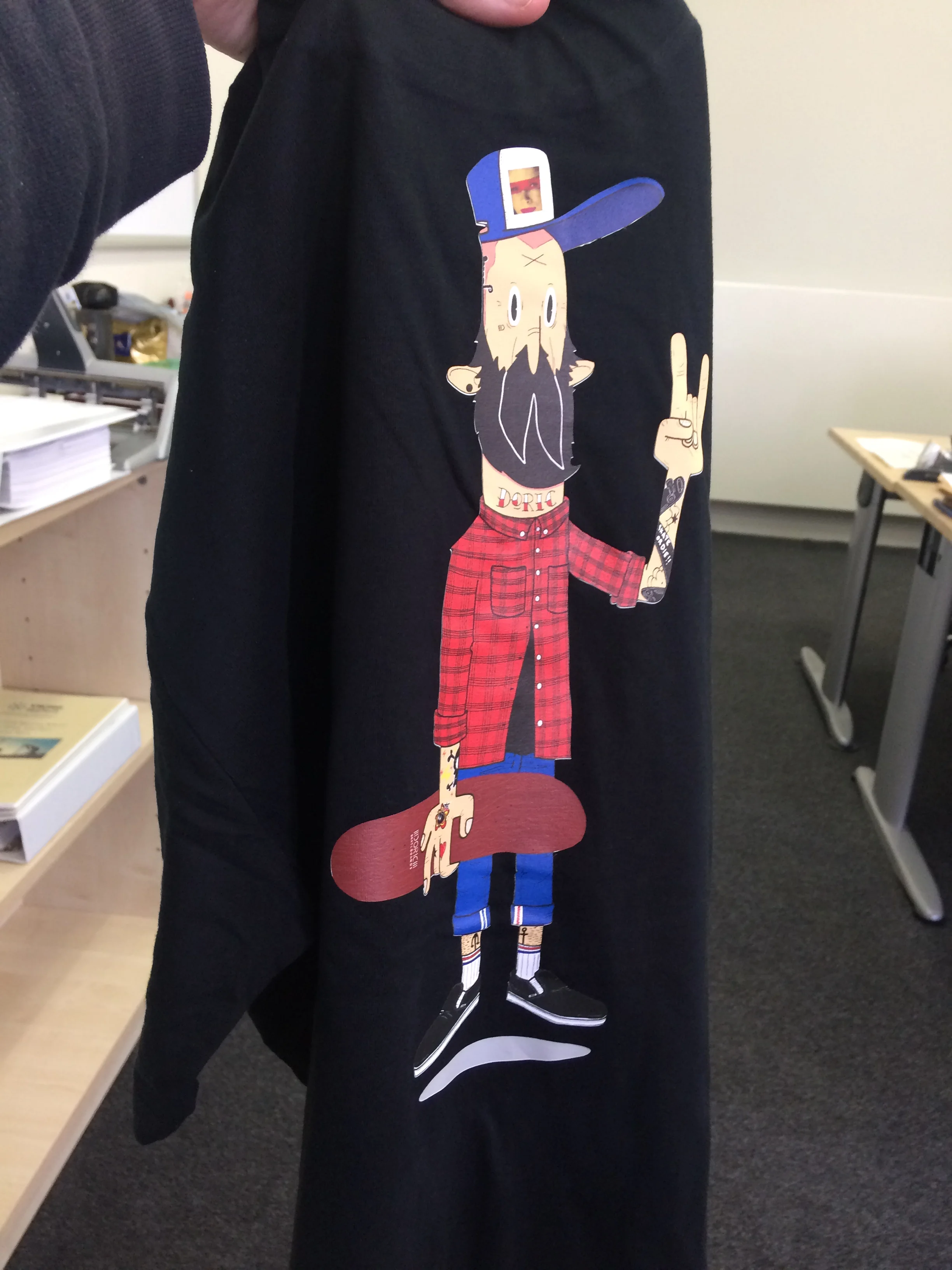
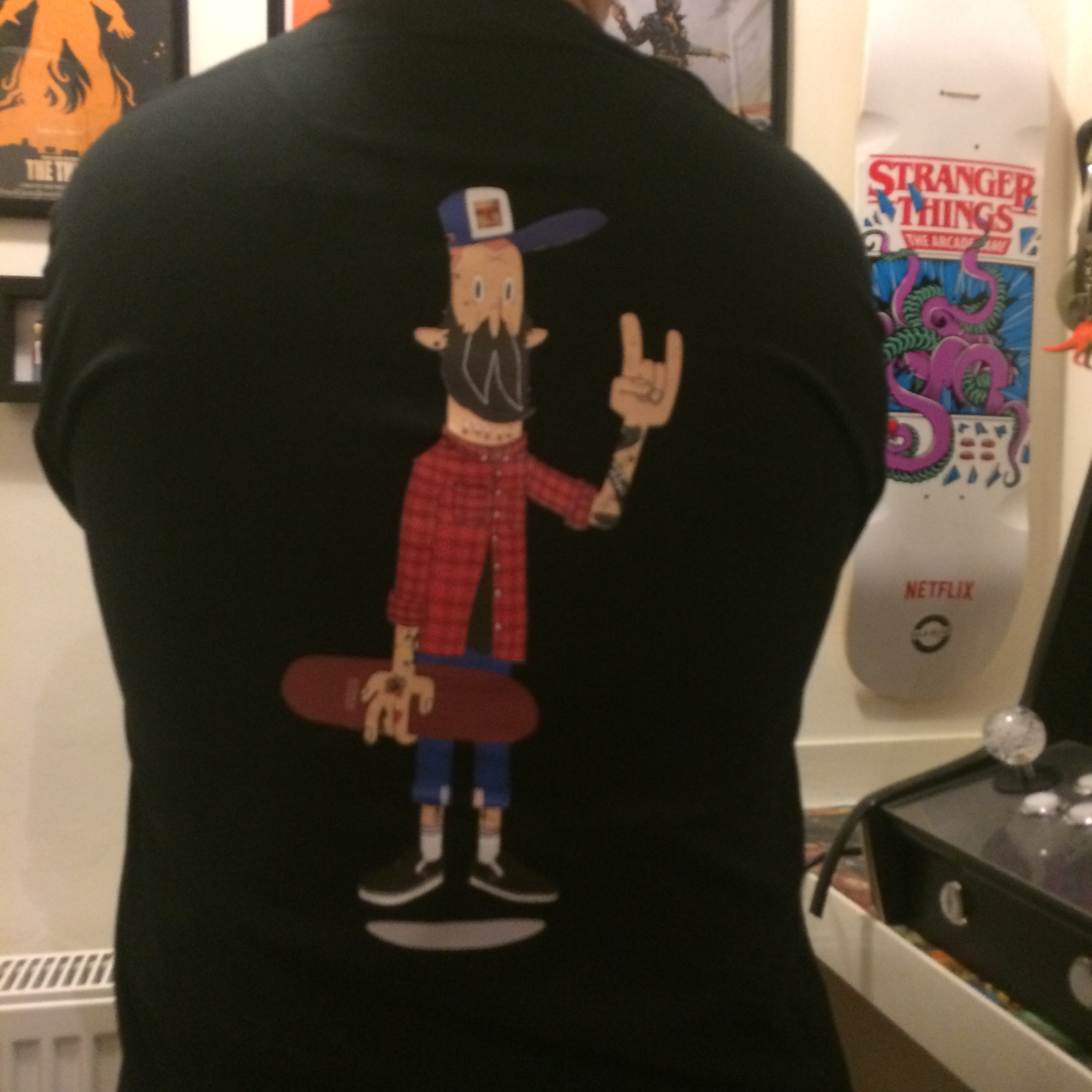
And so it came to pass that myself and Justin (aka Honk) decided to get together on a wee project. Luckily he'd already done the design a while back - he'd sent me an illustration months ago, way before we met or chatted and i loved it. Wasn't until we actually met and scoped each other out that the colab came together. The idea was for me to screen the illustration onto some decks - easy right?
Nah. Not really. The design didn't take too long to agree - the basis was there, so we just ironed out the details and went with it.
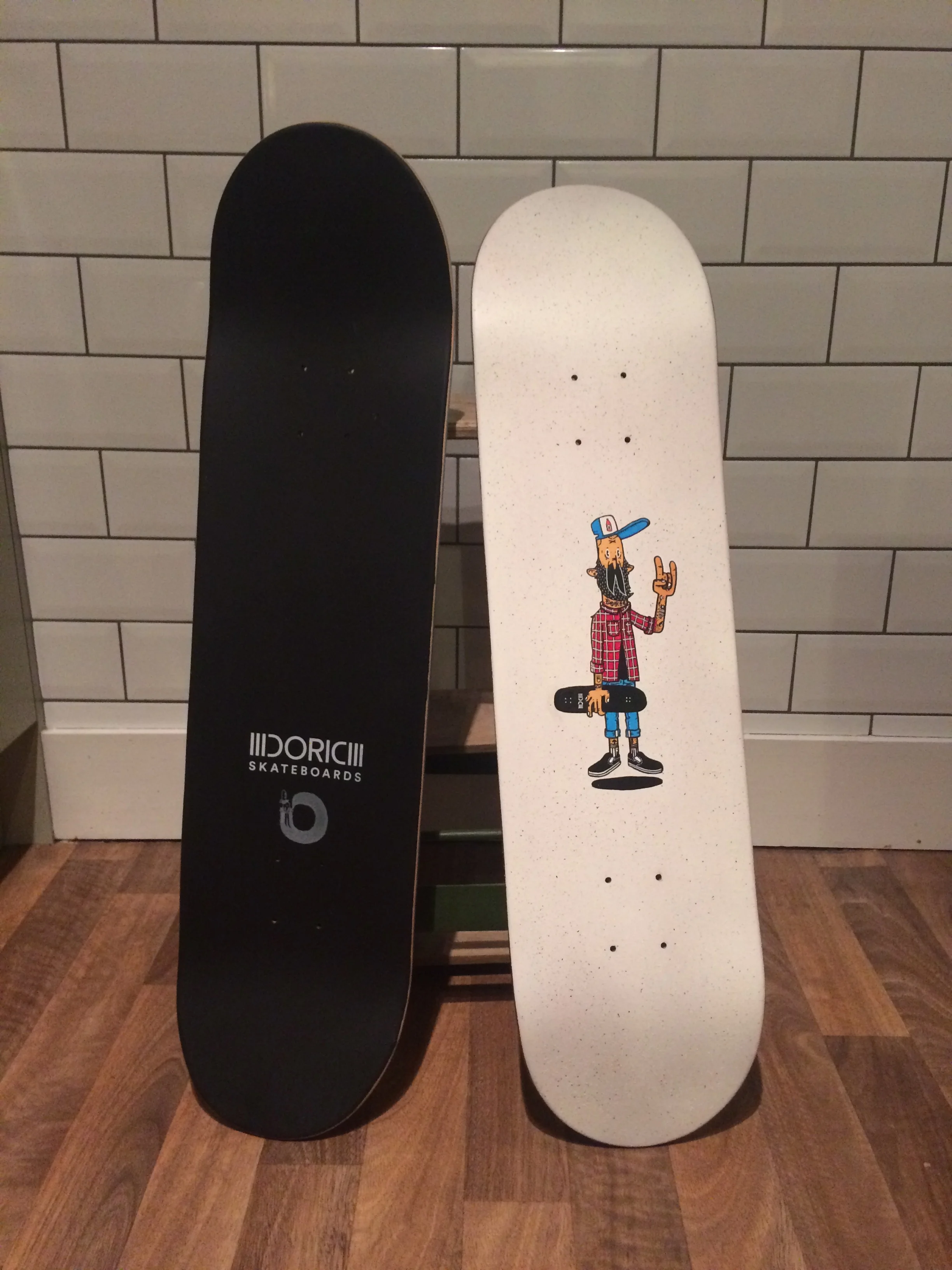
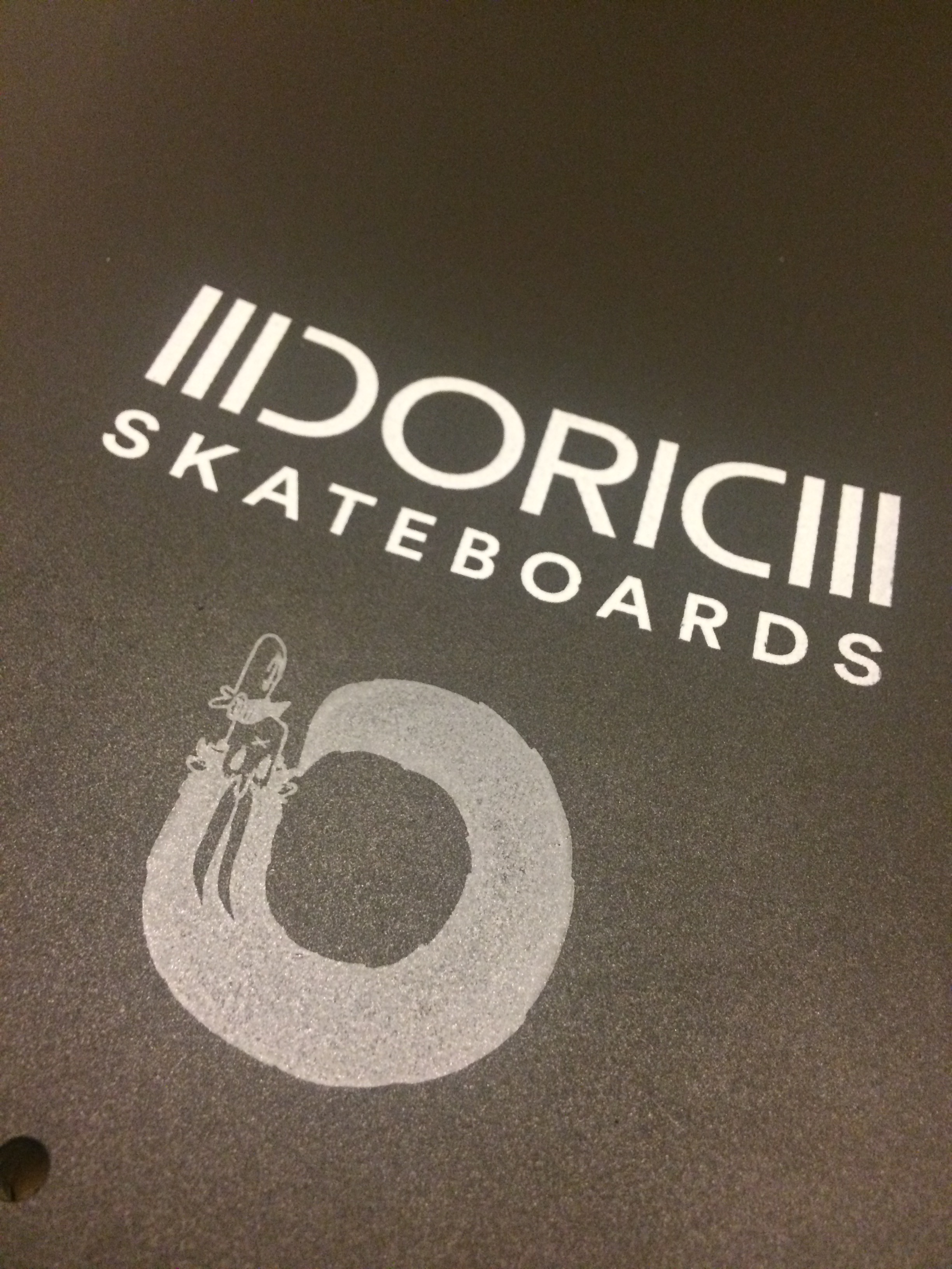
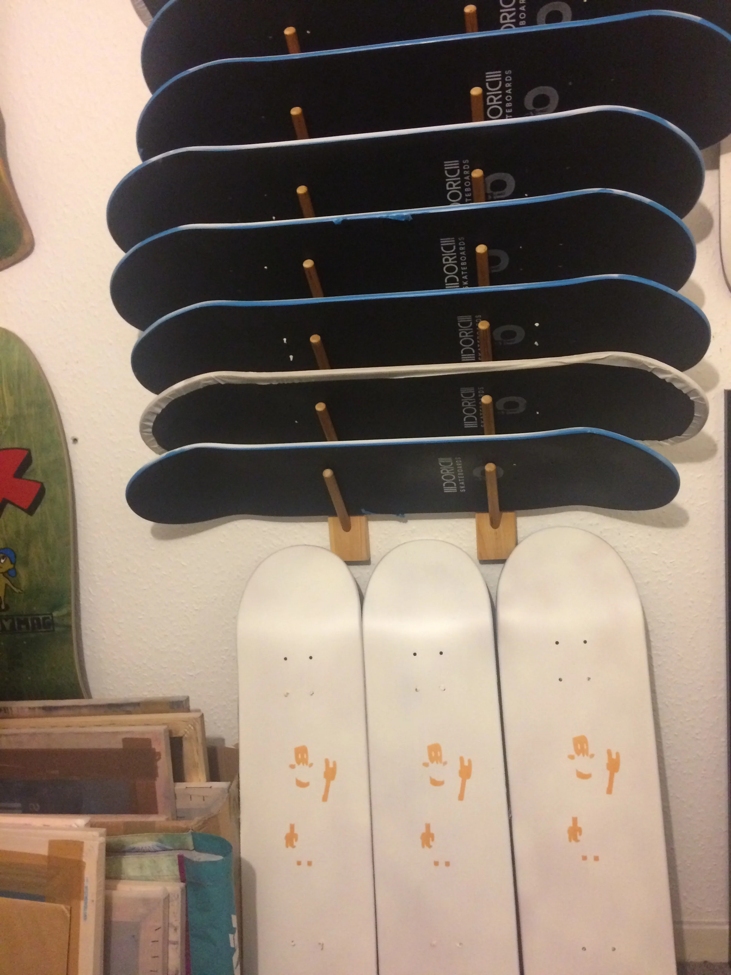
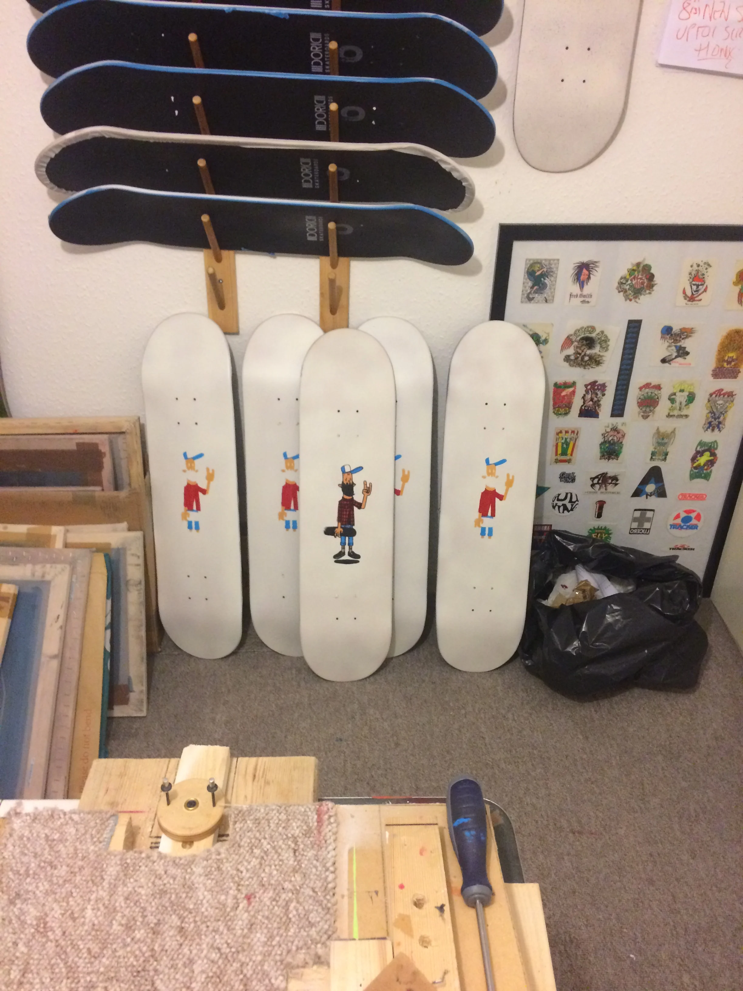
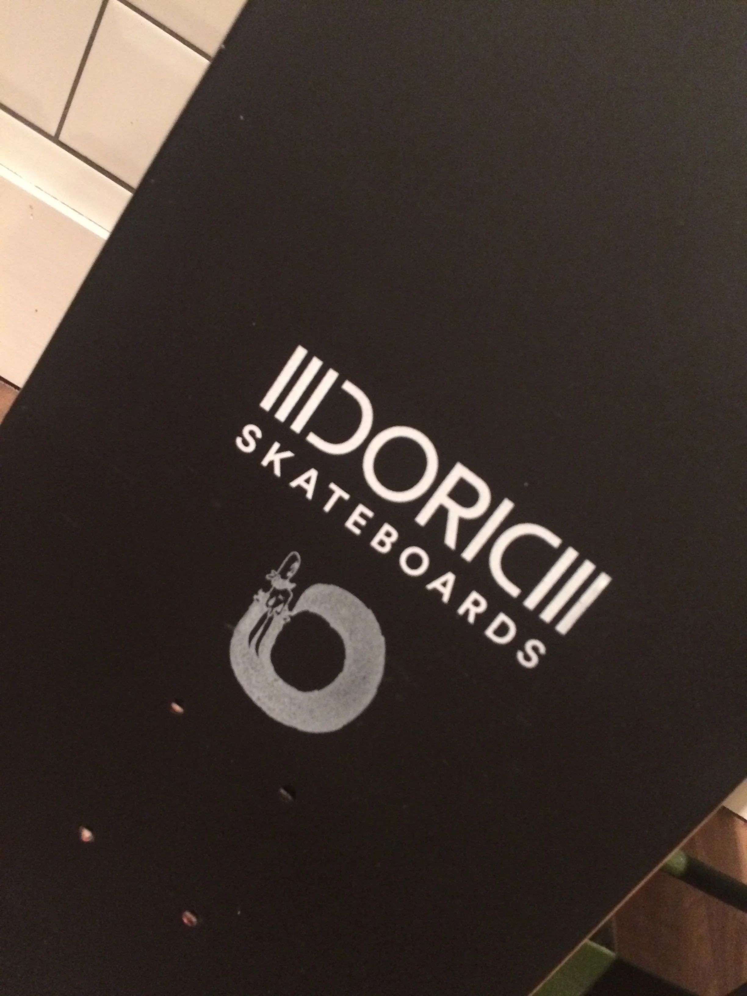
Stage 1. Topside logos. Now, a lot of folk don't care much for top side logos on skateboards. Most folk just cover it up with griptape. But for me its important, its an integral part of skateboard art and culture. So as with most things i decided to make things difficult. I thought a black topside would look good. So, Stage 1, Tape up all decks and then spray them black.
Stage 2. Screen the logos. Can be tricky to screen onto the concave surface. You find that the upward angle of the concave restricts the distance you can have the screen from the surface of the deck. This means that to bridge that gap you need more force - but with that force comes the risk of smudging. Thankfully i get them all done and Justin pops round to add his logo. He opts for a stamp after some experimentation. All coming together now.
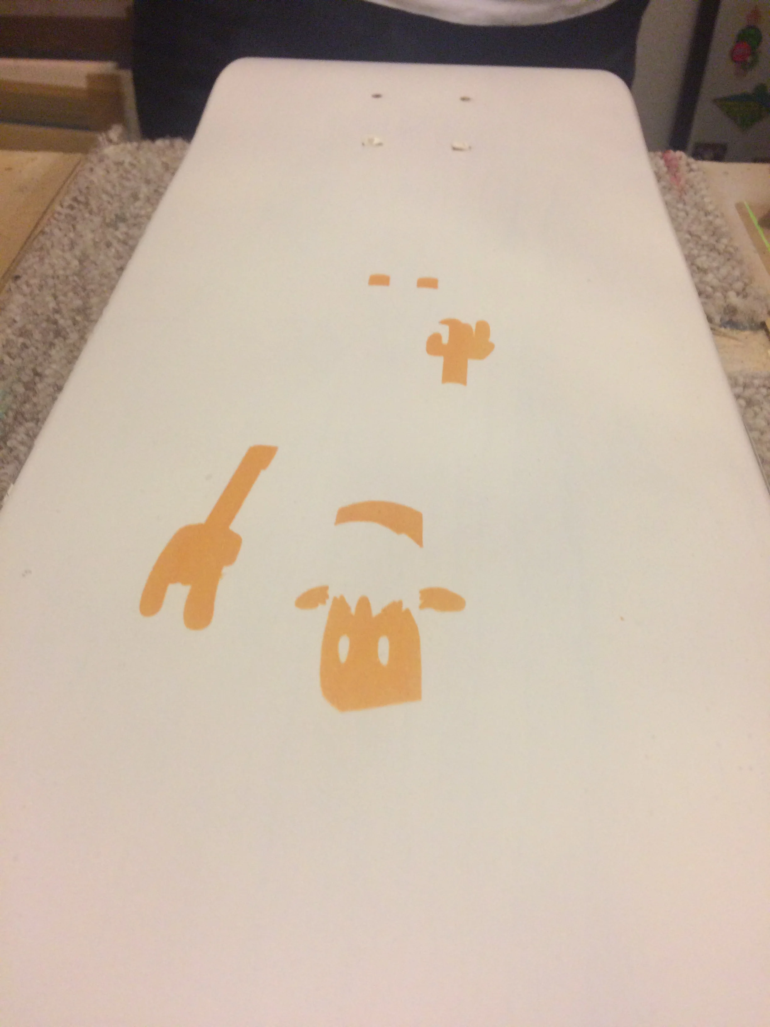
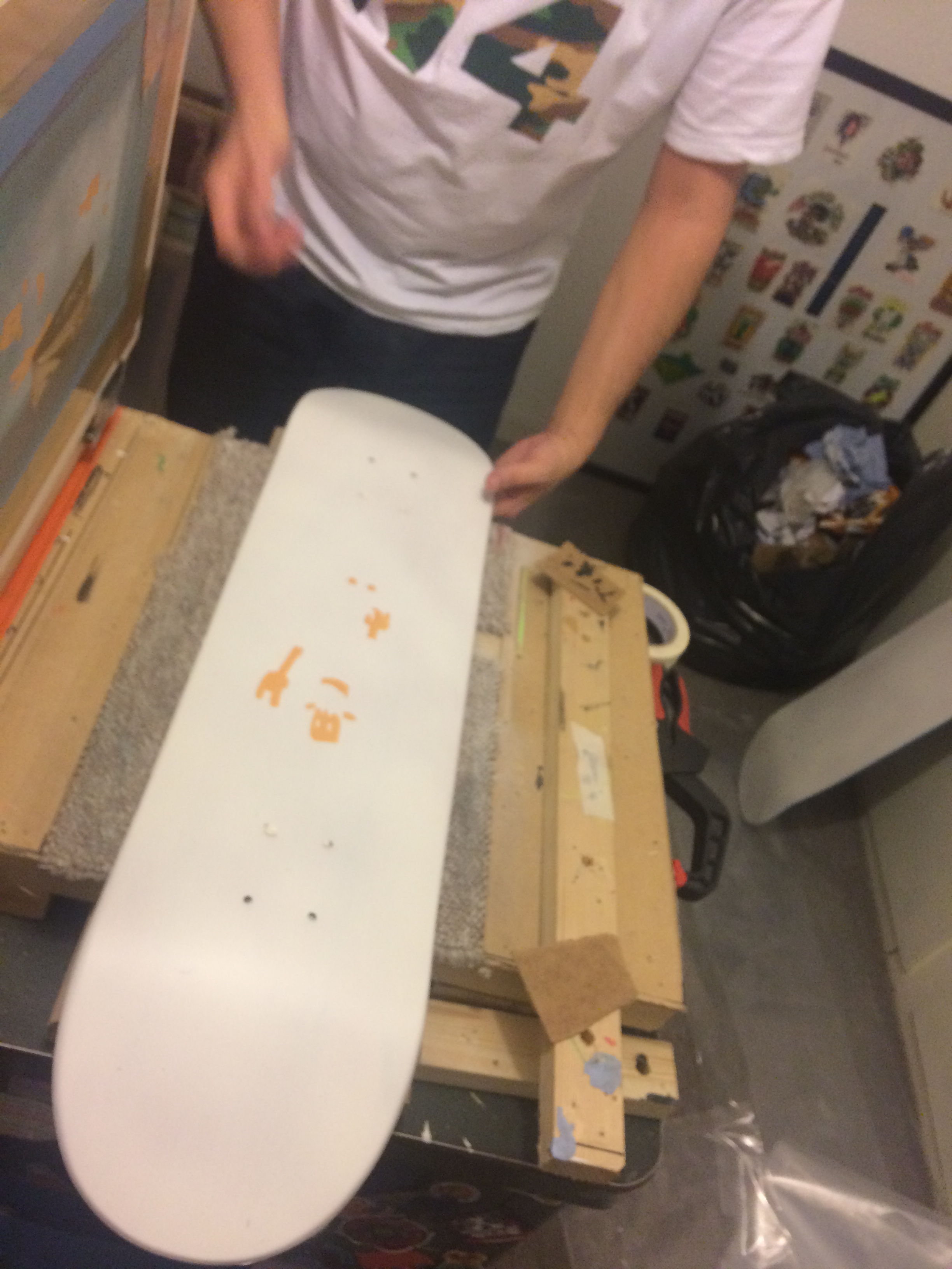
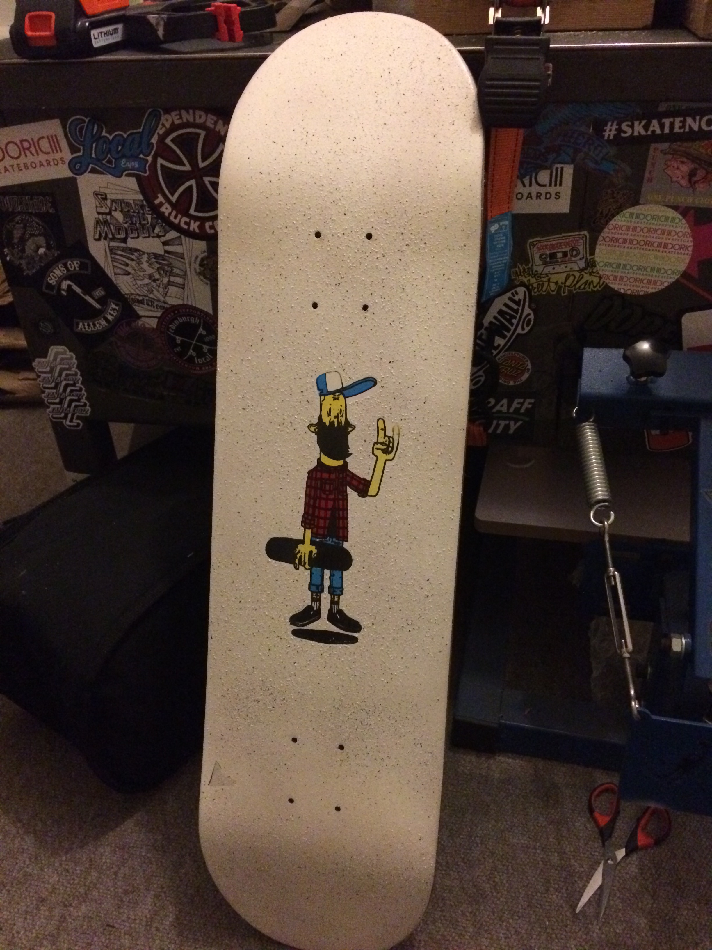
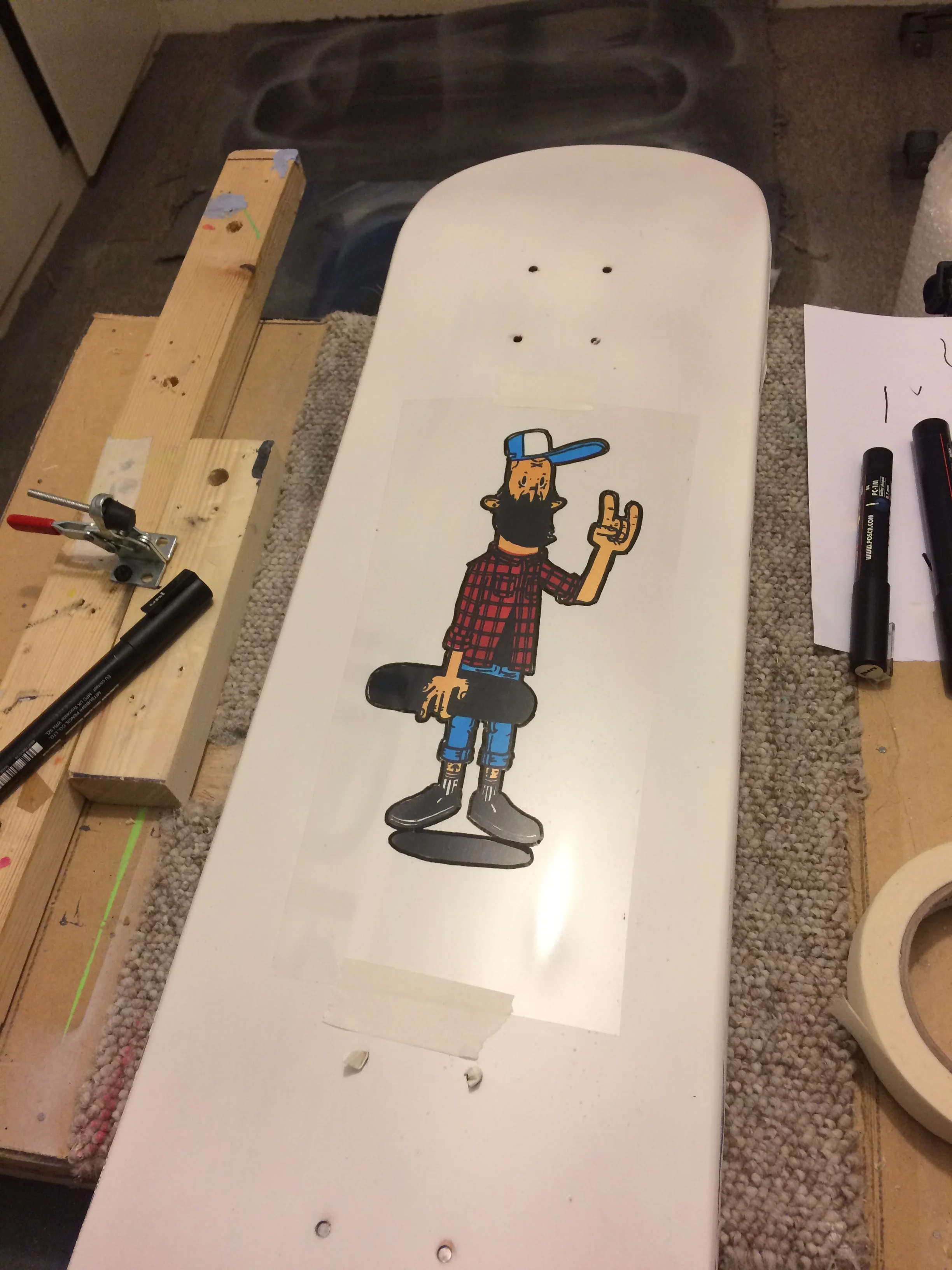
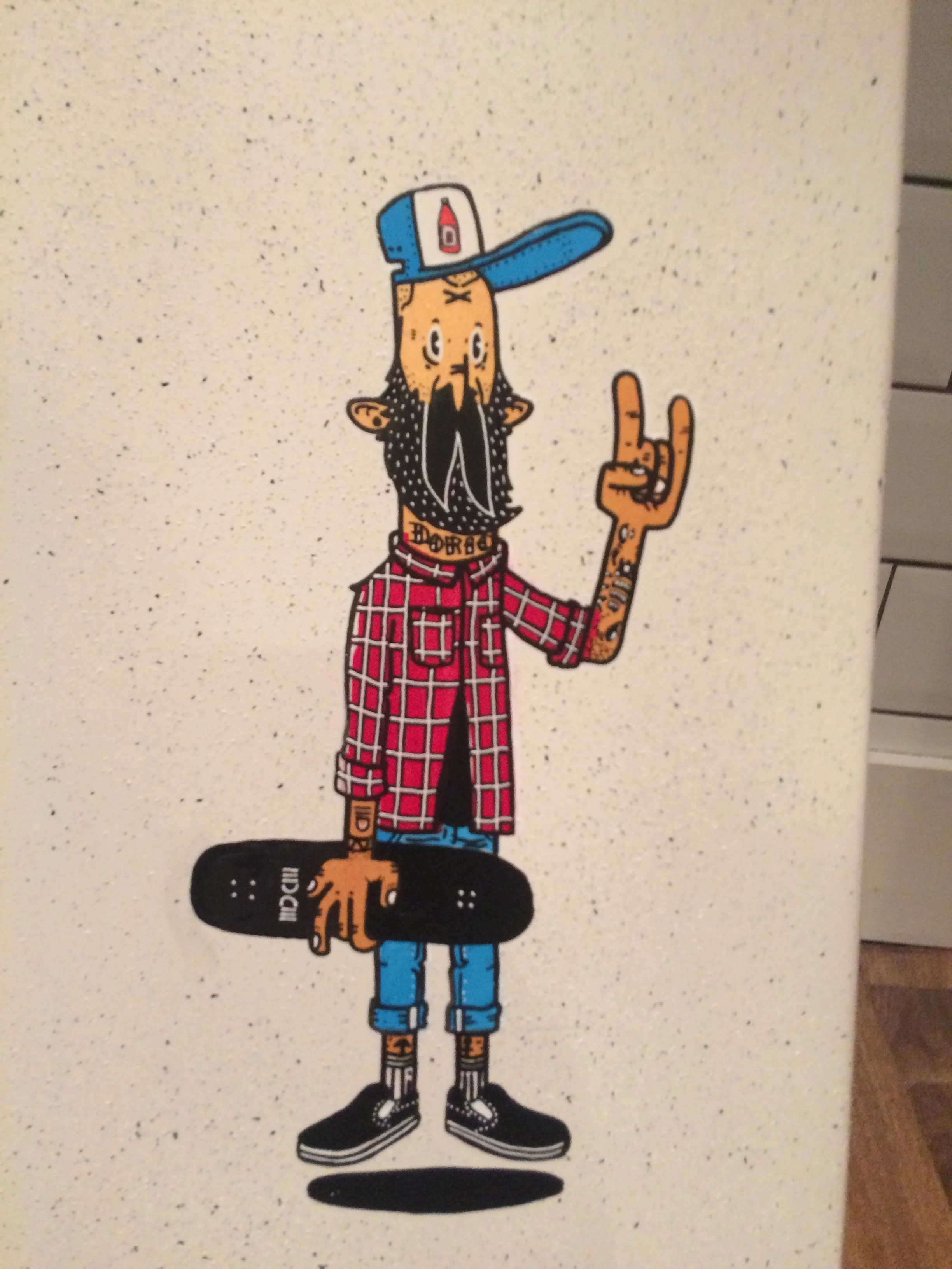
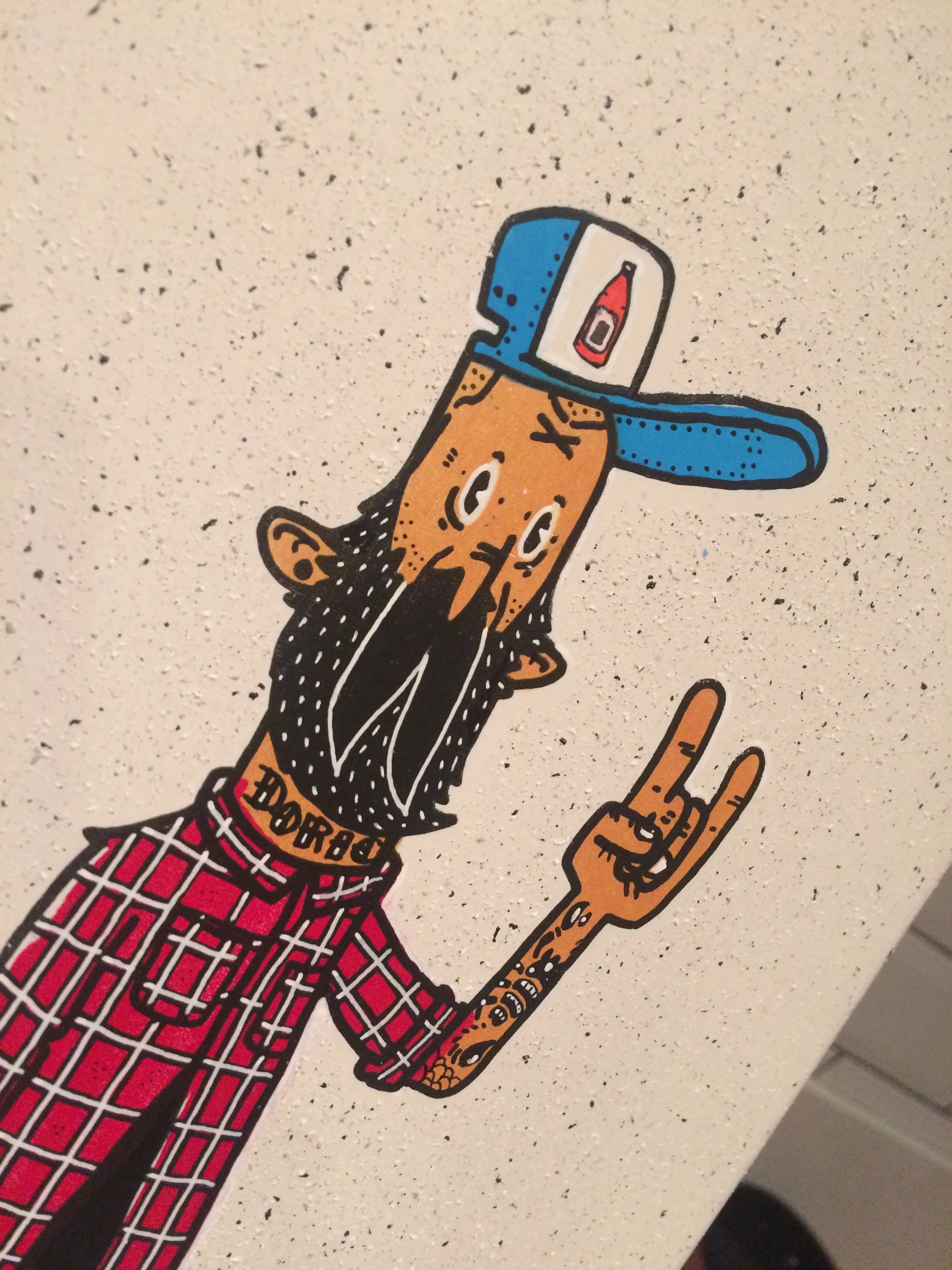
Stage 3. Prepare the underside for the main graphic. Again i take the harder route. I love Justin's illustrations with a stark white background. So i decide to spray all the undersides white. Takes time and effort, taping them up and getting them done. But jobs a good un.
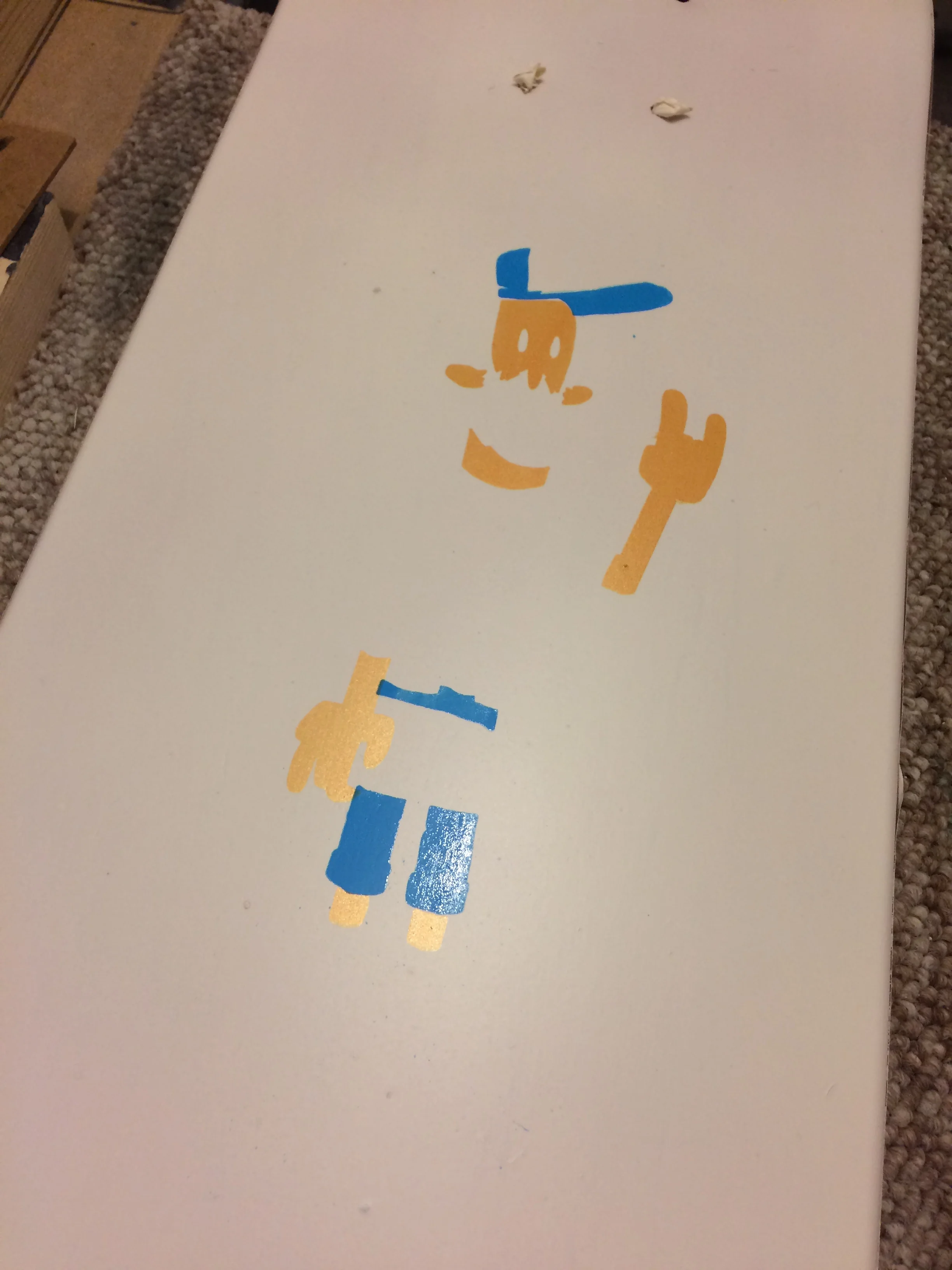
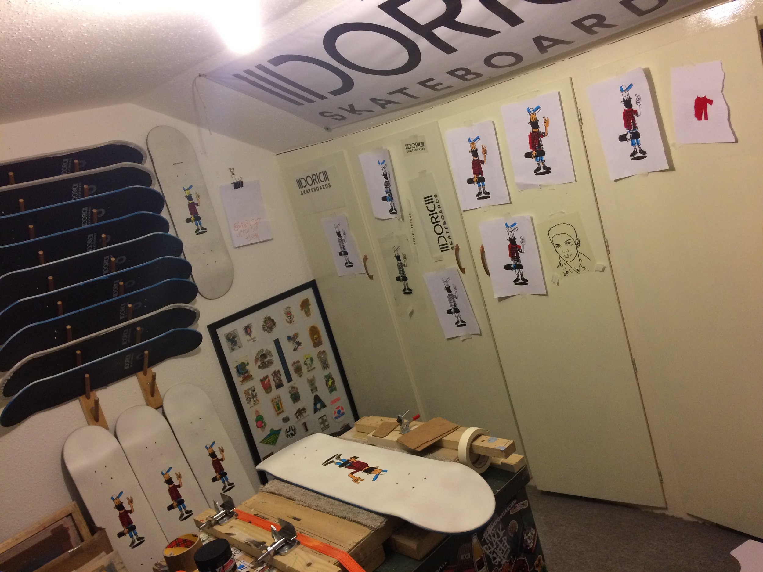
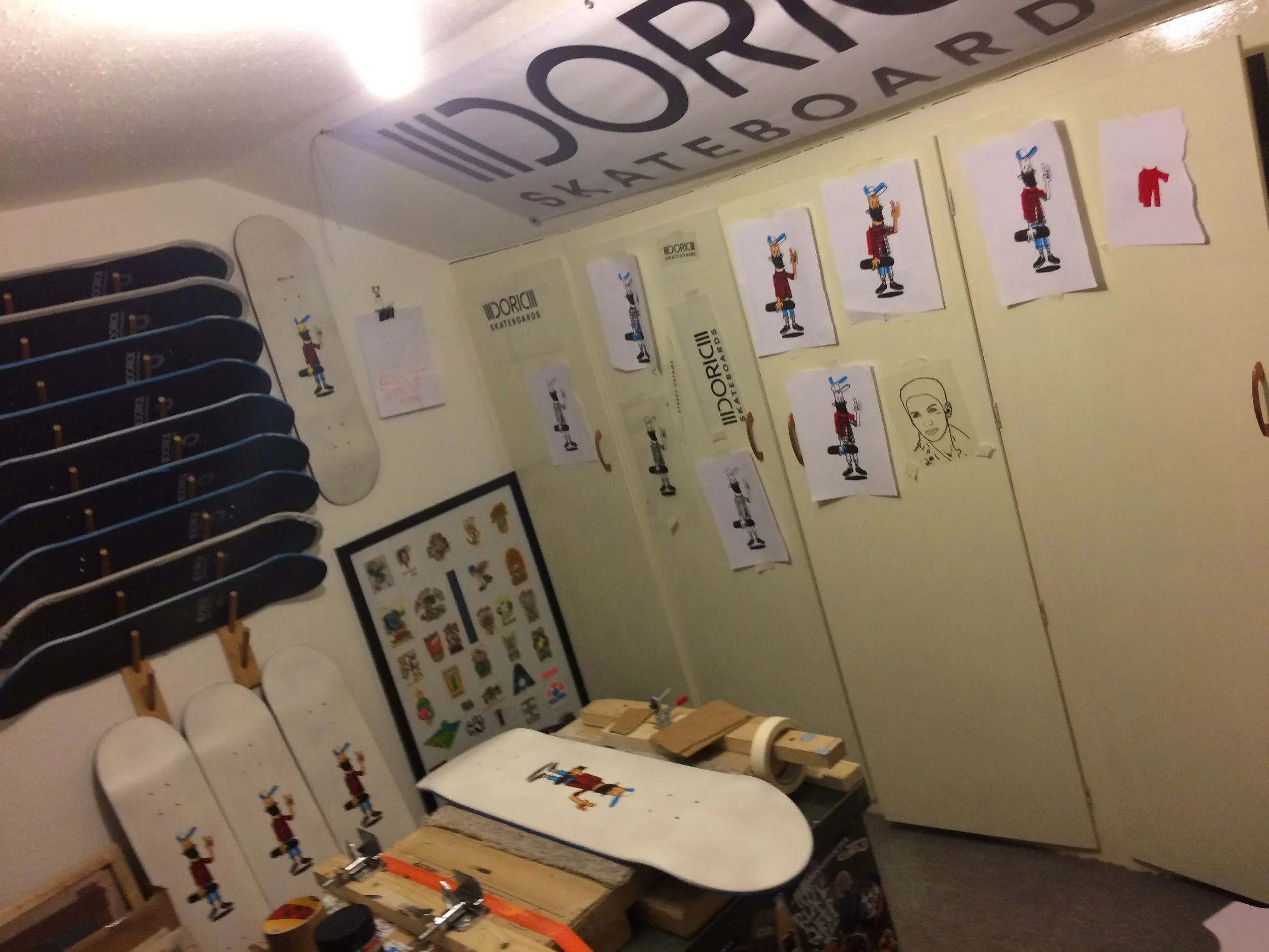
Stage 4. Now its getting serious. Quick screen print tutorial - Part 1. To have screens to pass ink through you need separations. These are usually (as is the case here) prepared on acetate with each sheet representing each colour you have in your illustration. This one needed 4. So Justin gets to work preparing them by hand. As with anything by hand discrepancies will occur but its these that make this what it is. Its not a factory line. I could get them done like that - never touch the wood the decks are made of, never add anything to it. But that's too easy and not what i'm about. Justin prepares the acetates, 4 in total and passes it to me like a baton - both metaphorically and literally - they are in a tube. So then i sprint off to Peacocks Visual Arts to use their equipment to prepare the screens.
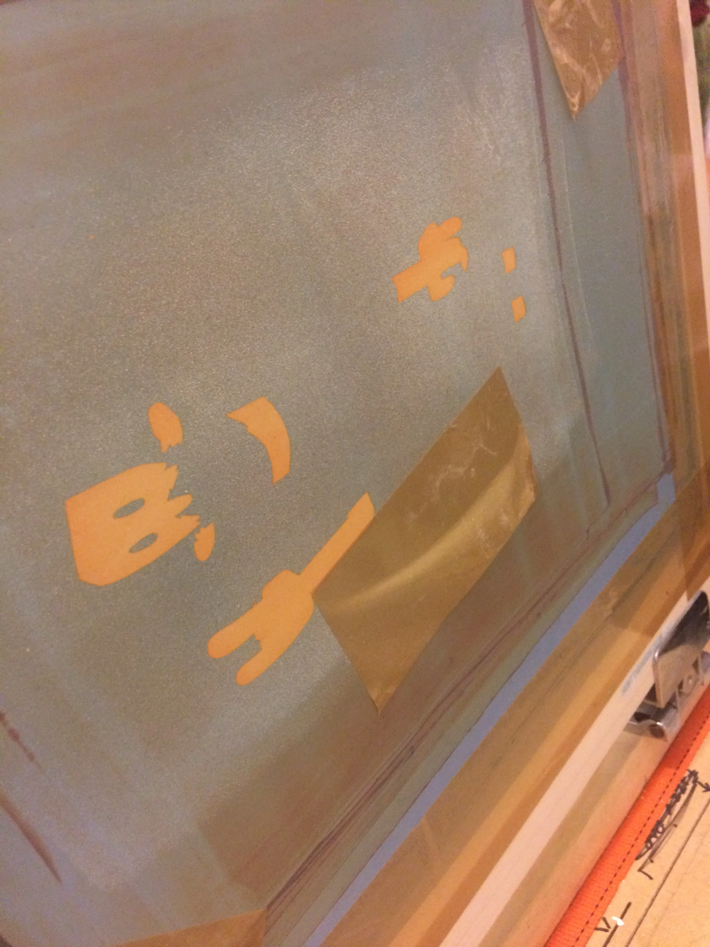
Stage 5. Ok, i didnt sprint. Ambled, mosied, cantered, plodded. Yeah plodded. Get to Peacocks. Class's are on. Bugger. Need to postpone by a week. Perhaps i can prepone by taking a day off work? I wanted to use the word prepone but its also true - so i take time off and get down to Peacocks and get screens done. Things can go wrong when preparing screens. Quick screen print tutorial - Part 2. You have a wooden or metal frame with silk stretched over it. To this silk you need to add an emulsion. This emulsion is photo sensitive. To apply it you fill a wee trough and spread it over the screen in one fluid, solid motion. Sometimes i'm not fluid. Nor solid. What happens there is that you get an uneven coat. Too thick in places and it'll never dry. And if and when it does and you expose it to light with your image, sure as shit that thickness will peel away and ruin your screen. And so thats what happened. So then i have to wait until the next Saturday. That Saturday arrives and i get them done. I never really know how well they've turned out until i get home and try them out. I could try them out at Peacock but i prefer to run away and die on my arse in private....But it seems ok. Just ok? Maybe its me. Its not perfect so its ok. Maybe that means its good? There are a couple of obvious errors but nothing insurmountable. So now its onto actually cracking on and doing it.
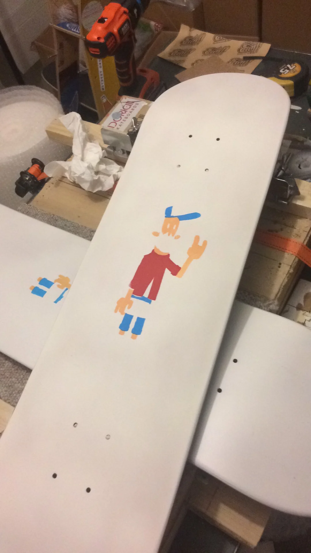
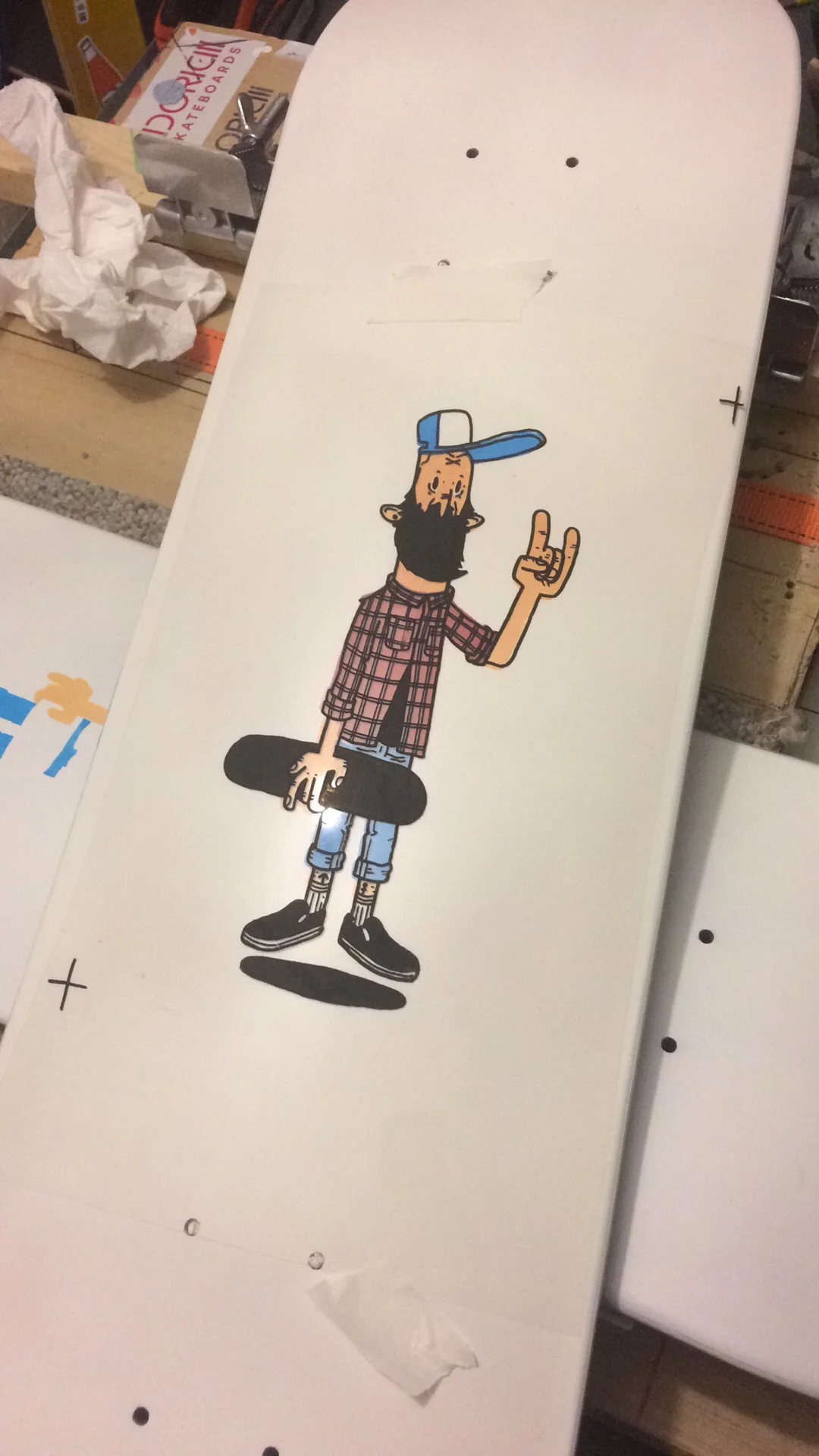
Stage 6. Doing it. Done it. Prototype comes out quite well but skin tone needs to be mixed. Haven't mixed colours since school. How hard can it be? ; ) I also think the stark white needs something more. I decide on the granite effect that i've done on other decks. So far we have Spray paint (3 kinds), screen prints (5 screens if you include the topside) and a Honk stamp. What else can we add? How else can we make it harder? Oh aye, we decide that Justin will individually add some finer detail by hand. Makes sense - the coming together of all these mediums! So prototype done and i'm ready to go for real. Then the fear.
Stage 7. Fear. Fear of messing it up. Fear of it being crap. Fear of not doing it justice. But finally you just have to go for it. And go for it i have.
Conclusion:
I hope you like it. At very very least i hope you appreciate the effort. Its a learning curve all the time for me and i've locked in many a lesson on this one. I think/hope Justin and myself will collaborate again - i look forward to it.
Until then - go buy a deck or a tee or print (oh aye forgot to say we did those too!). Support the effort. Support local. Support small. And go check out Justin's other work aka Honk.